CSS - Flexible Box
09 Apr 2022 | cssFlexible Box
Flexible Box는 CSS3에 처음 소개된 기능으로 반응형 웹을 아주 쉽게 만들 수 있는 기술입니다. 기존의 속성들로는 박스의 배치 순서를 변경하거나 자유롭게 바꾸는 것이 불가능했지만, Flexible Box를 이용하면 아주 쉽고 자유롭게 다양한 화면을 구성할 수 있습니다.
기존에는
float와 같은 요소들이 있었으나 화면의 요소들을 ‘배치’하는 기술이 아니었습니다.
축의 방향
Flexible Box는 주축과 교차축이 있습니다. 축의 방향은 가장 중요한 요소로 방향이 가로인경우는 왼쪽에서 오른쪽으로, 방향이 세로인 경우는 위에서 아래쪽으로 박스들이 배치됩니다.
Flexible Box 작동을 위한 기본 설정
아주 간단한 Flexible Box의 기본 설정은 다음과 같습니다.
#wrap {
  display: -webkit-flex;
  display: flex;
  width: 90%;
  height: 500px;
  margin: 0 auto;
  background: orange;
}
flexible-direction
flex-direction 속성을 이용해서 자식 상자들의 방향을 정할 수 있습니다.
- row : 박스를 왼쪽에서 오른쪽으로 배치
- row-reverse
- column : 박스를 위에서 아래로 배치
- column-reverse
#wrap {
  display: -webkit-flex;
  display: flex;
  flex-direction: row;
  ...
}
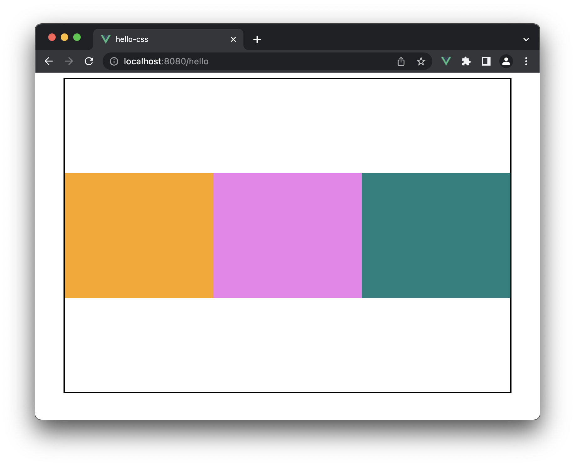
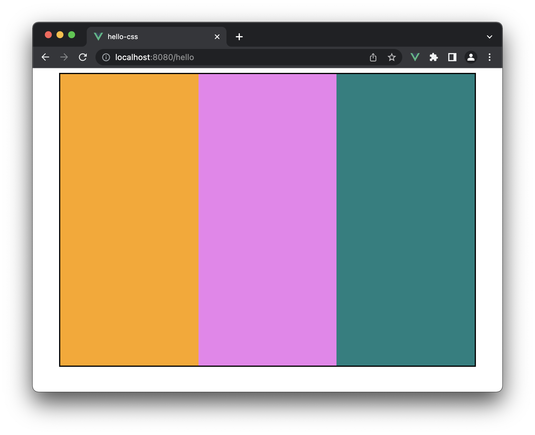
예제
<template>
  <div id="wrap">
    <div></div>
    <div></div>
    <div></div>
  </div>
</template>

<script>
export default {
  name: "App",
};
</script>

<style>
#wrap {
  display: -webkit-flex;
  display: flex;
  flex-direction: row;
  width: 90%;
  height: 500px;
  margin: 0 auto;
  background: white;
  border: 2px solid black;
}

#wrap div {
  width: 33.333%;
}

#wrap div:first-child {
  background: orange;
}

#wrap div:nth-child(2) {
  background: violet;
}

#wrap div:nth-child(3) {
  background: teal;
}
</style>
아이템을 여러 줄로 배치하기
기본적으로 Flexible Box 내의 자식 박스들은 한 줄로만 배치됩니다.
만약 여러 줄로 배치하고 싶은 경우에는 flex-wrap 속성을 넣어줘야 합니다. 사용해야 합니다.
- nowrap(기본값) : 박스를 한 줄로 배치
- wrap : 박스를 여러 줄로 배치
- wrap-reverse
flex-flow
flex-flow를 이용해서 flex-direction과 flex-wrap을 한 번에 설정할 수도 있습니다.
#wrap {
  display: -webkit-flex;
  display: flex;
  flex-flow: row wrap;
  ...
}
justify-content
주축 방향으로 박스를 정렬하는 명령어입니다.
- flex-start(기본값)
- flex-end
- center
- space-between
- space-around
align-items
교차축 방향으로 박스를 배치할 경우에는 align-items 속성을 이용할 수 있습니다.
- stretch(기본값) : 박스를 확장해서 배치
- flex-start
- flex-end
- center
- baseline : 시작점에 배치되는 자식 박스의 글자 베이스 라인에 맞춰 배치
예제
<template>
  <div id="wrap">
    <div></div>
    <div></div>
    <div></div>
  </div>
</template>

<script>
export default {
  name: "App",
};
</script>

<style>
#wrap {
  display: -webkit-flex;
  display: flex;
  flex-flow: row wrap;
  align-items: center;
  width: 90%;
  height: 500px;
  margin: 0 auto;
  background: white;
  border: 2px solid black;
}

#wrap div {
  width: 33.33%;
  height: 200px;
}

#wrap div:first-child {
  background: orange;
}

#wrap div:nth-child(2) {
  background: violet;
}

#wrap div:nth-child(3) {
  background: teal;
}
</style>