07 Apr 2022
|
css
id=”wrap”
대부분의 웹사이트 소스를 보면 항상 wrap 또는 wrapper 아이디의 <div> 태그들이 존재합니다.
<template>
  <div id="wrap">
    <div class="container">Hello</div>
    ...

  </div>
</template>

<style>
#wrap {
  width: 90%;
  height: 480px;
  margin: 0 auto;
  border: 2px solid black;
  background: wheat;
}
</style>
특별한 의미가 있는 것은 아니고, 특별한 아이디로 웹 문서 전체를 감싸면 웹 문서의 내용이나 배경, 가운데 정렬 등 전반적인 속성을 쉽게 변경할 수 있기 때문입니다.
07 Apr 2022
|
css
편의상 Vue로 개발한 예제입니다.
App.vue
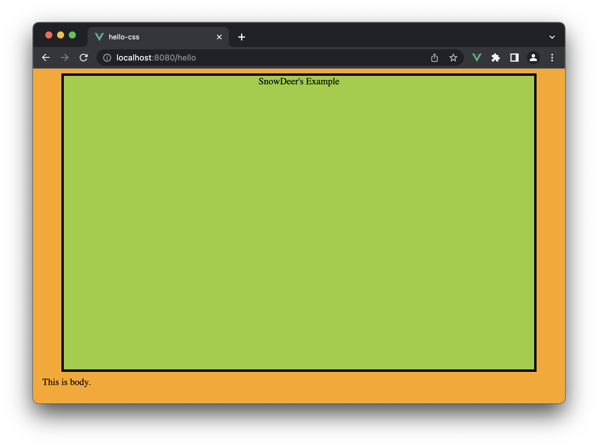
화면에 보이는 상자는 화면 크기의 90%만큼 동적으로 변하는 반응성 상자입니다.
<template>
  <div id="head">SnowDeer's Example</div>
  <div>Hello. SnowDeer</div>
</template>

<script>
export default {
  name: "App",
};
</script>

<style>
#head {
  width: 90%;
  height: 500px;
  margin: 0 auto;
  background: yellowgreen;
  border: 4px solid black;
  text-align: center;
}

@media all and (min-width: 500px) {
  body {
    background: teal;
  }
}

@media all and (min-width: 800px) {
  body {
    background: orange;
  }
}
</style>
실행 화면
웹 브라우저가 500px 이상이면 배경이 teal 색상으로 변경됩니다.
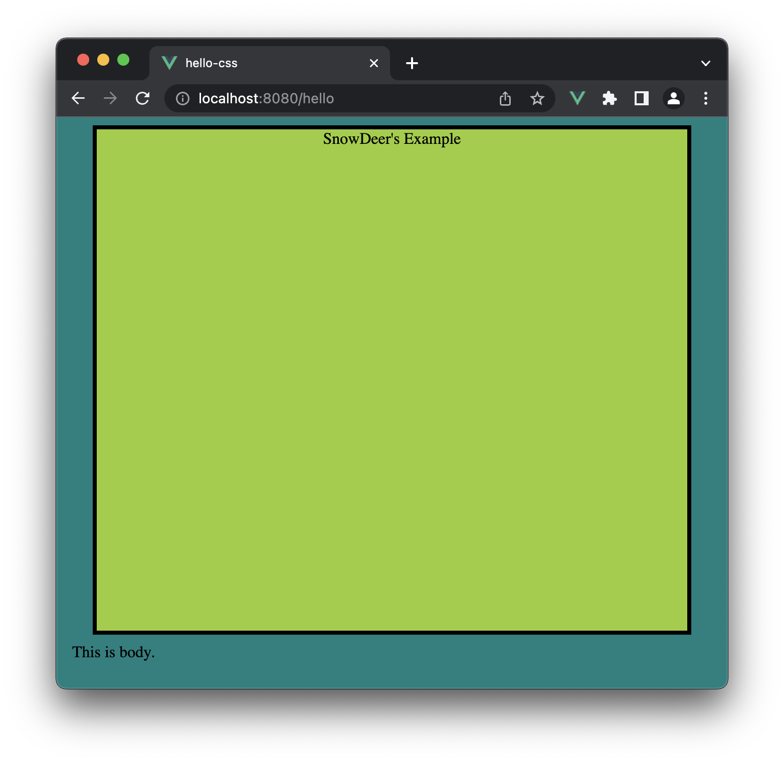
웹 브라우저가 800px 이상이면 배경이 orange 색상으로 변경됩니다.
Media Query 문법은 다음과 같습니다.
@media [only 또는 not] [미디어 유형] [and 또는 ,] (조건문) {실행문}
06 Apr 2022
|
Vue.js
css
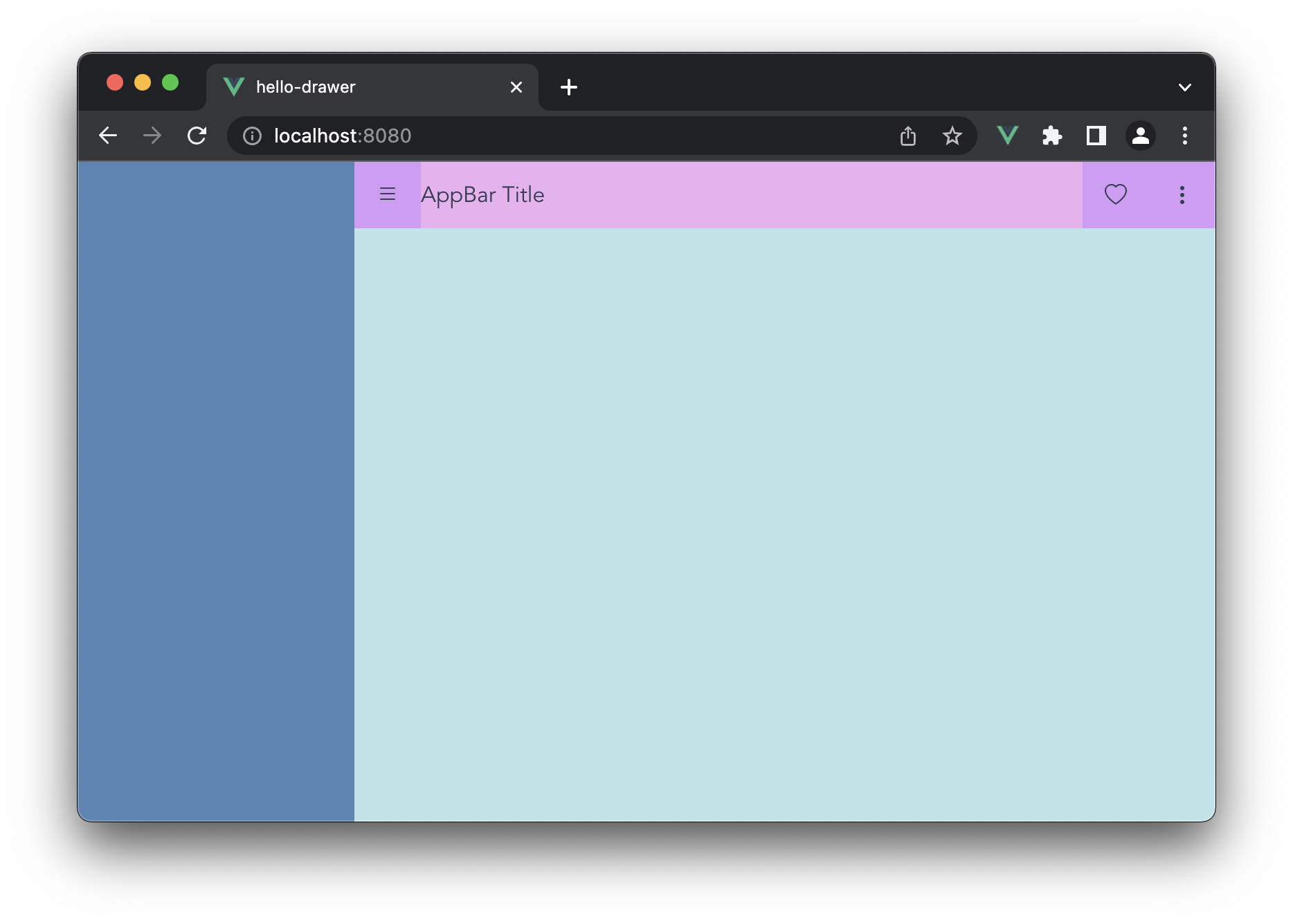
AppBar 레이아웃
<template>
  <div id="wrapper">
    <div id="drawer"></div>
    <div id="main">
      <div id="appbar">
        <div id="hamburg-menu" class="h-center v-center">
          <i class="bi bi-list"></i>
        </div>
        <div id="title" class="v-center">AppBar Title</div>
        <div id="action-items">
          <i class="action-item bi bi-heart"></i>
          <i class="action-item bi bi-three-dots-vertical"></i>
        </div>
      </div>
      <div id="content"></div>
    </div>
  </div>
</template>

<style>
.h-center {
  display: flex;
  flex-direction: row;
  justify-content: center;
}

.v-center {
  display: flex;
  flex-direction: row;
  align-items: center;
}

#app {
  font-family: Avenir, Helvetica, Arial, sans-serif;
  -webkit-font-smoothing: antialiased;
  -moz-osx-font-smoothing: grayscale;
  text-align: center;
  color: #2c3e50;
}

#wrapper {
  display: -webkit-flex;
  display: flex;
  flex-flow: row wrap;
  justify-content: flex-start;
  width: 100vw;
  height: 100vh;
  margin: 0 auto;
}

#appbar {
  display: flex;
  flex-direction: row;
  height: 48px;
  background: #edb1f1;
}

#hamburg-menu {
  width: 48px;
  height: 48px;
  background: #d59bf6;
  cursor: pointer;
}

#title {
  flex: 1;
  height: 48px;
}

#action-items {
  display: flex;
  flex-direction: row;
  height: 48px;
  background: #d59bf6;
}

.action-item {
  width: 48px;
  height: 48px;
  display: flex;
  justify-content: center;
  align-items: center;
  cursor: pointer;
}

#drawer {
  width: 200px;
  height: 100vh;
  background: #5585b5;
}

#main {
  flex: 1;
  flex-flow: column wrap;
  justify-content: flex-start;
  background: #bbe4e9;
}
</style>
06 Apr 2022
|
Vue.js
css
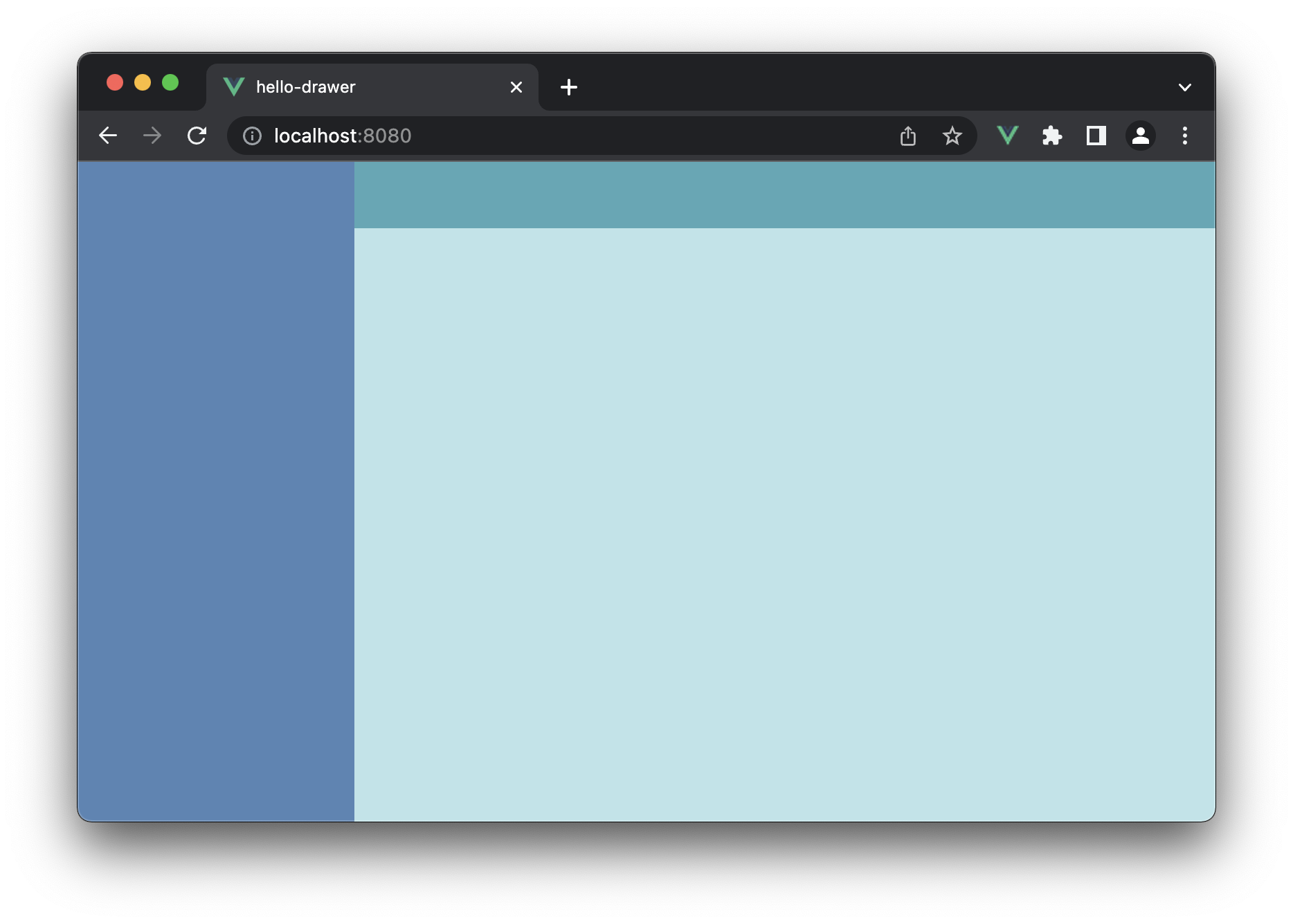
기본 스켈레톤 레이아웃
<template>
  <div id="wrapper">
    <div id="drawer"></div>
    <div id="main">
      <div id="appbar"></div>
      <div id="content"></div>
    </div>
  </div>
</template>

<style>
#app {
  font-family: Avenir, Helvetica, Arial, sans-serif;
  -webkit-font-smoothing: antialiased;
  -moz-osx-font-smoothing: grayscale;
  text-align: center;
  color: #2c3e50;
}

#wrapper {
  display: -webkit-flex;
  display: flex;
  flex-flow: row wrap;
  justify-content: flex-start;
  width: 100vw;
  height: 100vh;
  margin: 0 auto;
}

#drawer {
  width: 200px;
  height: 100vh;
  background: #5585b5;
}

#main {
  flex: 1;
  flex-flow: column wrap;
  justify-content: flex-start;
  background: #bbe4e9;
}

#appbar {
  height: 48px;
  background: #53a8b6;
}
</style>
05 Apr 2022
|
Vue.js
css
Vue 기본 여백(margin) 제거하기
Vue.js로 화면을 띄우면 기본적으로 상하좌우 8px의 여백이 있습니다.
아래의 코드를 이용해서 여백을 없앨 수 있습니다.
위치는 App.vue에 넣어도 되고, public/index.html에 넣어도 되는데 후자가 더 깔끔한 위치라고 생각합니다.
<style>
body {
  margin: 0px;
}
</style>