Pixi.js Viewport 상에서의 Event
19 Apr 2022 | javascript html5Pixi.js Viewport 상에서의 Event
pixi-viewport라는 유틸리티를 이용해서 구현한 예제입니다.
package.json
아래와 같이 모듈을 추가해주면 됩니다.
...

"dependencies": {
  "core-js": "^3.8.3",
  "pixi-viewport": "^4.34.4",
  "pixi.js-legacy": "^6.3.0",
  "vue": "^3.2.13"
},

...
PixiView.vue
<template>
<div id="container">
<div id="pixi-canvas"></div>
</div>
</template>
<script>
import "./js/pixi-app";
import { PixiApp } from "./js/pixi-app";
export default {
mounted() {
this.createPixiApp();
},
methods: {
createPixiApp() {
const app = new PixiApp(800, 800);
const canvas = document.getElementById("pixi-canvas");
canvas.appendChild(app.view);
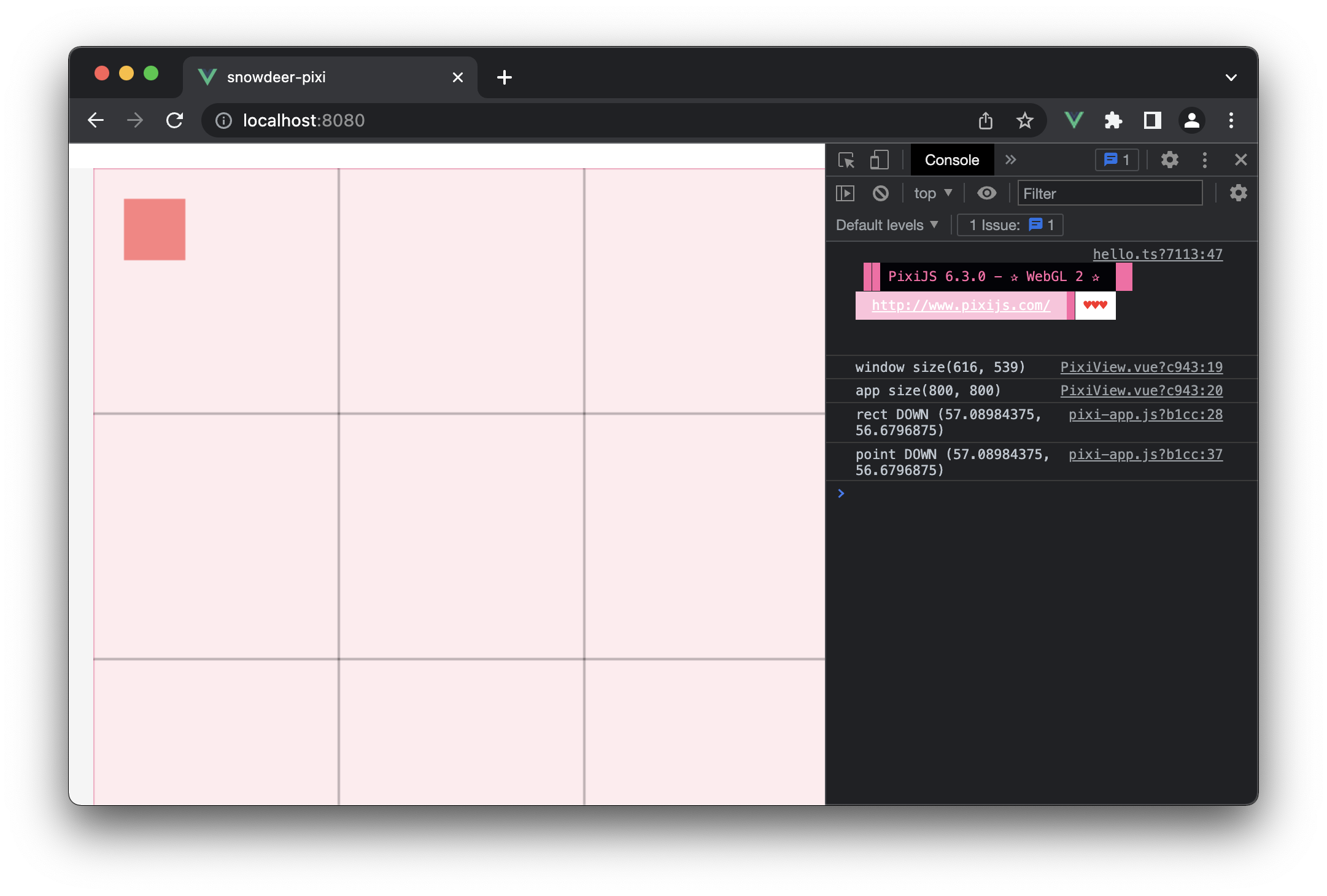
console.log(`window size(${window.innerWidth}, ${window.innerHeight})`);
console.log(`app size(${app.view.width}, ${app.view.height})`);
},
},
};
</script>
<style>
#container {
display: block;
width: 100vw;
height: 100vh;
background: whitesmoke;
}
#pixi-canvas {
display: block;
margin: 20px;
}
</style>
pixp-app.js
import * as PIXI from "pixi.js-legacy";
import { Viewport } from "pixi-viewport";
class PixiApp extends PIXI.Application {
constructor(width, height) {
super({
width: width,
height: height,
backgroundColor: 0xffebee,
antialias: true,
});
const viewport = new Viewport({
screenWidth: width,
screenHeight: height,
worldWidth: width * 2,
worldHeight: height * 2,
interaction: this.renderer.plugins.interaction, // the interaction module is important for wheel to work properly when renderer.view is placed or scaled
});
this.stage.addChild(viewport);
const rect = this.#createRect(100, 100);
viewport.addChild(rect);
rect.interactive = true;
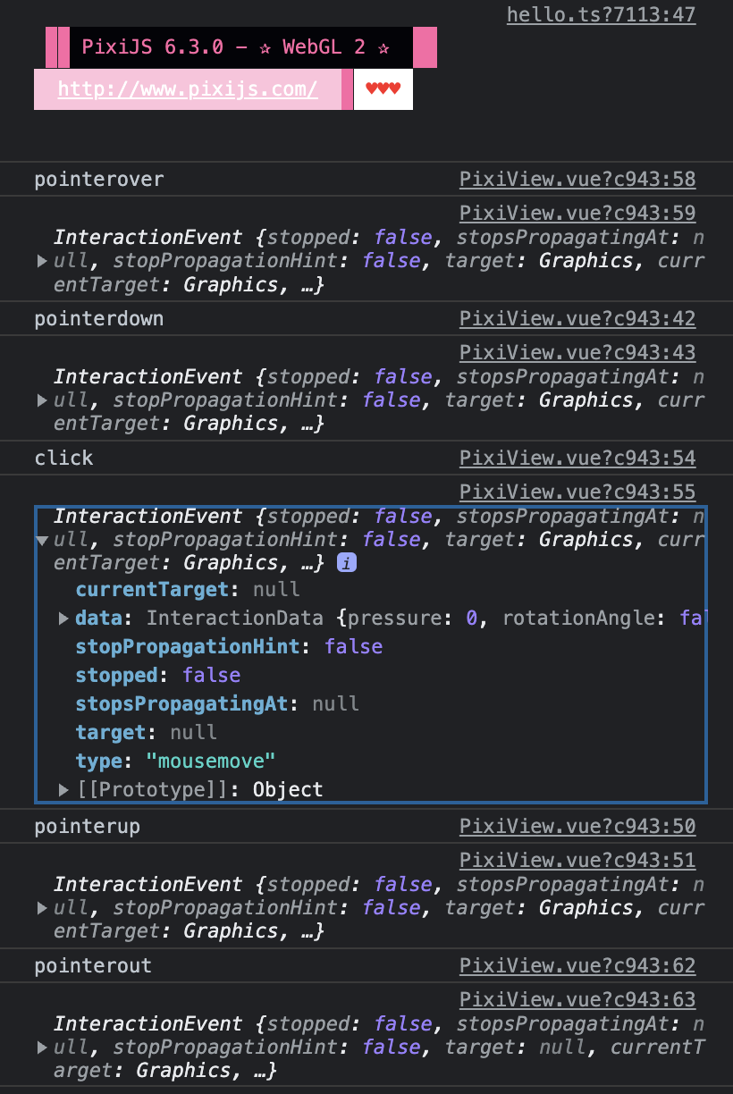
rect.on("pointerdown", (e) => {
console.log(`rect DOWN (${e.data.global.x}, ${e.data.global.y})`); // Viewport 좌표
});
const grid = this.#createGrid();
viewport.addChild(grid);
viewport.drag().pinch().wheel().decelerate();
viewport.on("pointerdown", (e) => {
console.log(`point DOWN (${e.data.global.x}, ${e.data.global.y})`); // Viewport 좌표
});
}
#createRect(centerX, centerY, width = 100, height = 100) {
const rect = new PIXI.Graphics();
rect.beginFill(0xff8080);
rect.drawRect(0, 0, width, height);
rect.pivot.set(width / 2, height / 2);
rect.position.set(centerX, centerY);
rect.endFill();
return rect;
}
#createGrid() {
const grid = new PIXI.Graphics();
grid.lineStyle(2, 0xf06292);
grid.moveTo(-2000, 0);
grid.lineTo(2000, 0);
grid.moveTo(0, -2000);
grid.lineTo(0, 2000);
grid.lineStyle(1, 0x000000);
for (let i = 1; i < 5; i++) {
grid.moveTo(i * 400, -2000);
grid.lineTo(i * 400, 2000);
grid.moveTo(-2000, i * 400);
grid.lineTo(2000, i * 400);
}
return grid;
}
}
export { PixiApp };
실행화면